Work on fonts
Font combinations are used here:
1. Yeseva One and Montserrat, because the first font belongs to antiquity and looks more calligraphic, and the second is grotesque without pronounced features. The first font is wide, and the second is elongated. which makes a good pair in contrast, and the static unites them

2. Podkova and Rubik, because both fonts are simple, the first is blocky with dynamic serifs, and the second is grotesque. The fonts are combined has rounded shapes, and the fonts themselves are geometric.

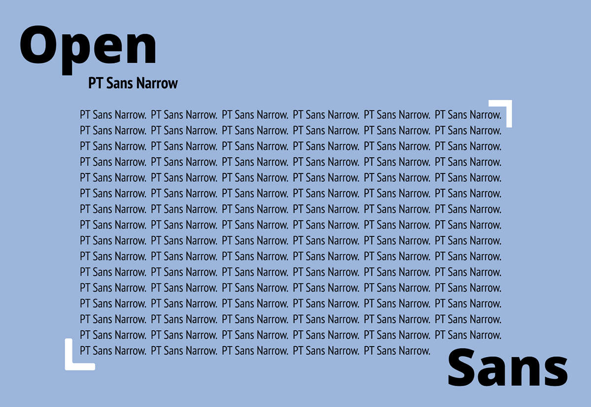
3. Open Sans and PT Sans Narrow are combined, differing in contrast, width. Here I made a typical mistake of a novice designer and made a narrow font for the main text unreadable, it is better to choose a regular font. Don't make my mistakes :)